SUMMARY

Lorem ipsum dolor sit amet, consectetur adipiscing elit. Nunc odio purus, tempus non condimentum eget, vestibulum.
The organisation identified the potential for expanding their client base, beyond their traditional enterprise clients, to privately-held companies with younger leadership. This required a slight shift in branding for the planned product variations while maintaining brand recognisability and link to the core brand values.
Investors in People
Brand refreshment
2018
Digital


SUMMARY
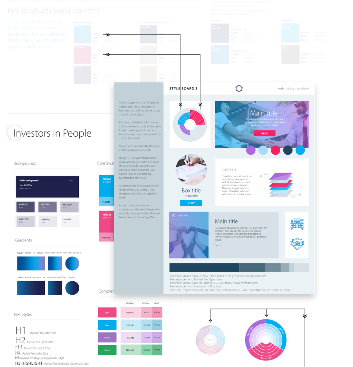
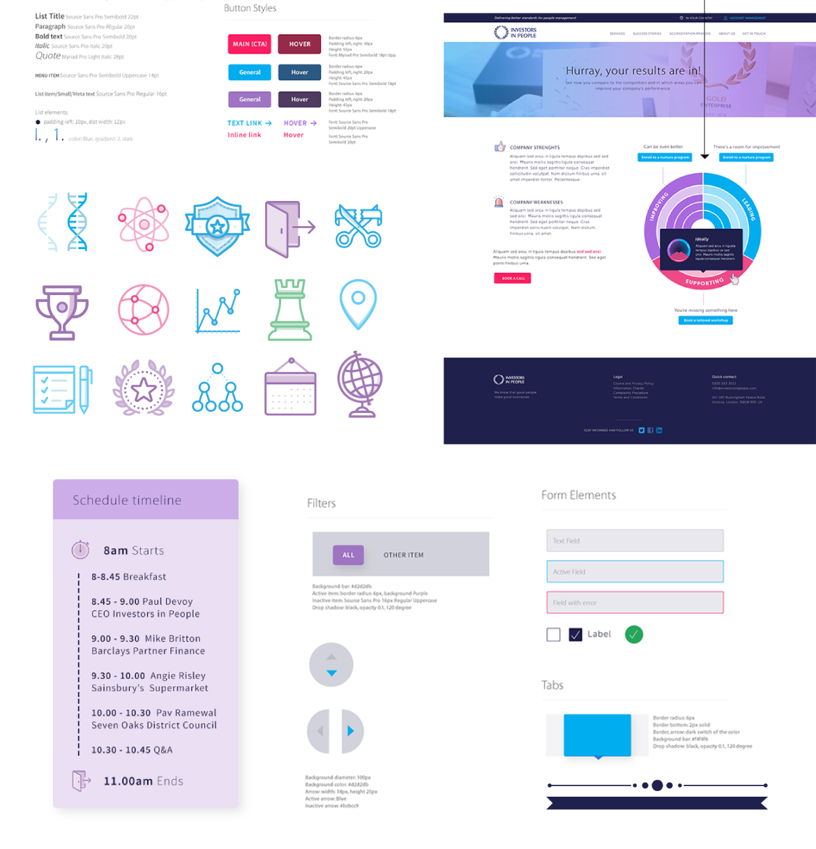
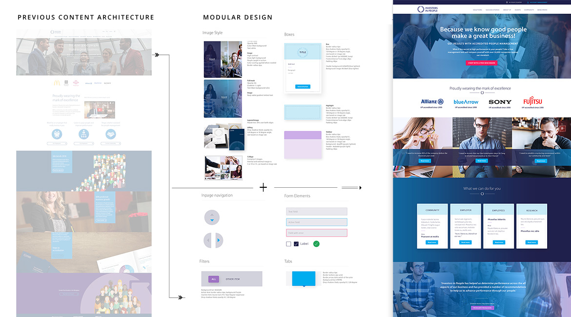
By maintaining essential visual elements that customers associate with the brand, while adapting new ones that resonate with new demographic visual preferences, I could maintain brand recognition during the design process. That included toning up the colours while staying within the domain, and swapping the icons into a line-art style while preserving the outline. To guarantee consistent brand expression across all touchpoints, I have developed a modular design that has reusable components and a scalable style guide.
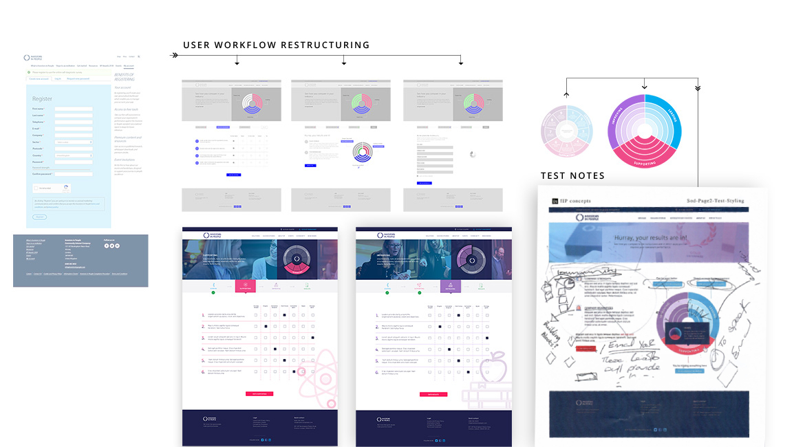
This strategic evolution also required a reassessment of the onboarding experience, aiming for both heuristic and hedonic principles to meet. I started the project with analysing client materials, such as satisfaction metrics, user journey pain points, engagement patterns and drop-off rates. The review was followed by a page restructuring, particularly in the initial engagement stages to capture the new customer segment.

